A blog on statistics, methods, philosophy of science, and open science. Understanding 20% of statistics will improve 80% of your inferences.

Tuesday, December 5, 2017

Understanding common misconceptions about p-values

A p-value is the probability of the observed, or more extreme, data, under the assumption that the null-hypothesis is true. The goal of this blog post is to understand what this means, and perhaps more importantly, what this doesn’t mean. People often misunderstand p-values, but with a little help and some dedicated effort, we should be able explain these misconceptions. Below is my attempt, but if you prefer a more verbal explanation, I can recommend Greenland et al. (2016).

First, we need to know what ‘the assumption that the null-hypothesis is true’ looks like. Although the null-hypothesis can be any value, here we will assume the null-hypothesis is specified as a difference of 0. When this model is visualized in text-books, or in power-analysis software such as g*power, you often see a graph like the one below, with t-values on the horizontal axis, and a critical t-value somewhere around 1.96. For a mean difference, the p-value is calculated based on the t-distribution (which is like a normal distribution, and the larger the sample size, the more similar the two become). I will distinguish the null hypothesis (the mean difference in the population is exactly 0) from the null-model (a model of the data we should expect when we draw a sample when the null-hypothesis is true) in this post. 


I’ve recently realized that things become a lot clearer if you just plot these distributions as mean differences, because you will more often think about means, than about t-values. So below, you can see a null-model, assuming a standard deviation of 1, for a t-test comparing mean differences (because the SD = 1, you can also interpret the mean differences as a Cohen’s d effect size). 


The first thing to notice is that we expect that the mean of the null-model is 0: The distribution is centered on 0. But even if the mean in the population is 0, that does not imply every sample will give a mean of exactly zero. There is variation around the mean, as a function of the true standard deviation, and the sample size. One reason why I prefer to plot the null-model in raw scores instead of t-values is that you can see how the null-model changes, when the sample size increases.


When we collect 5000 instead of 50 observations, we see the null-model is still centered on 0 – but in our null-model we now expect most values will fall very close around 0. Due to the larger sample size, we should expect to observe mean differences in our sample closer to 0 compared to our null-model when we had only 50 observations.

Both graphs have areas that are colored red. These areas represent 2.5% of the values in the left tail of the distribution, and 2.5% of the values in the right tail of the distribution. Together, they make up 5% of the most extreme mean differences we would expect to observe, given our number of observations, when the true mean difference is exactly 0 – representing the use of an alpha level of 5%. The vertical axis shows the density of the curves.

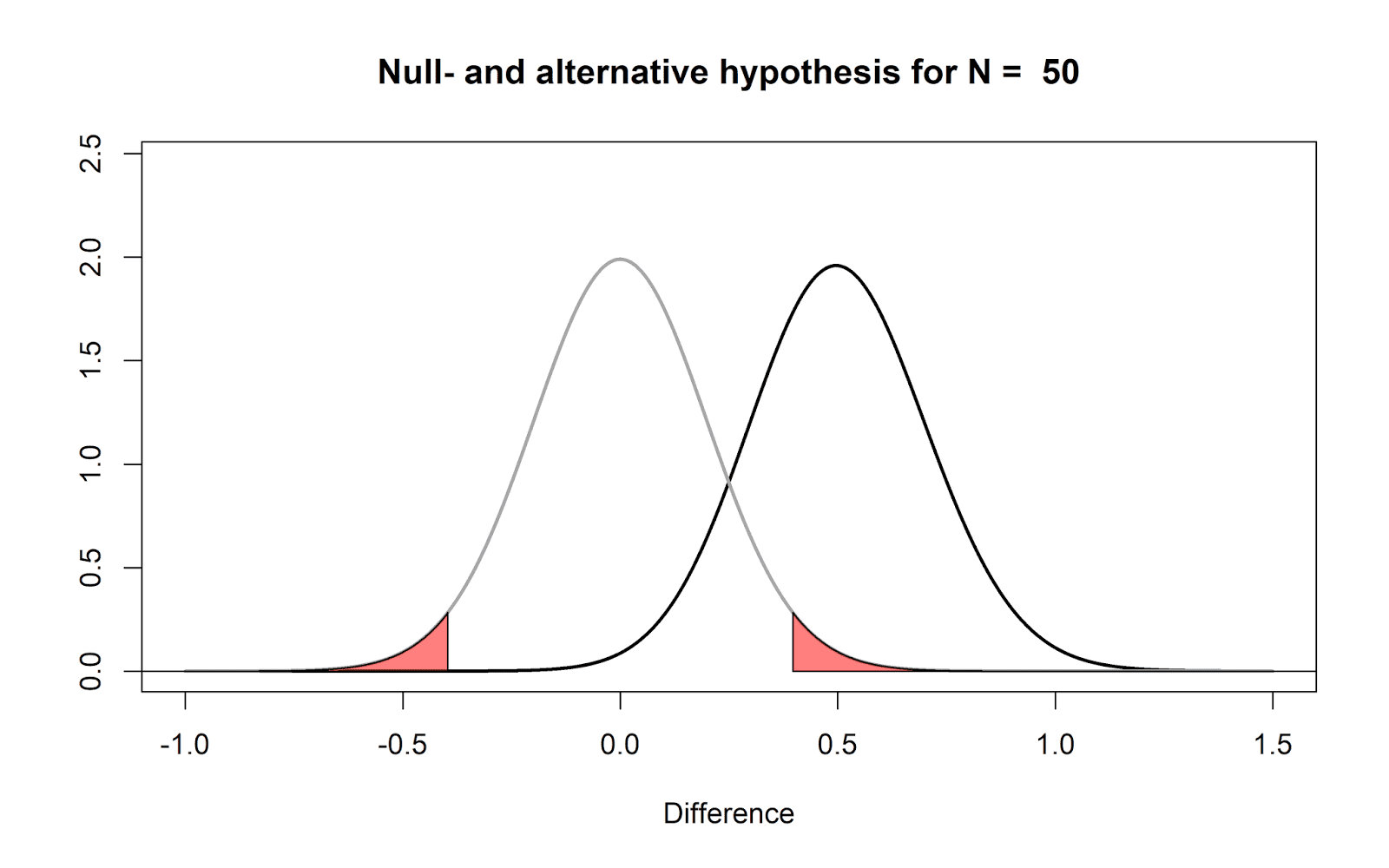
Let’s assume that in the figure visualizing the null model for N = 50 (two figures up) we observe a mean difference of 0.5 in our data. This observation falls in the red area in the right tail of the distribution. This means that the observed mean difference is surprising, if we assume that the true mean difference is 0. If the true mean difference is 0, we should not expect such a extreme mean difference very often. If we calculate a p-value for this observation, we get the probability of observing a value more extreme (in either tail, when we do a two-tailed test) than 0.5.

Take a look at the figure that shows the null-model when we have collected 5000 observations (one figure up), and imagine we would again observe a mean difference of 0.5. It should be clear that this same difference is even more surprising than it was when we collected 50 observations.

We are now almost ready to address common misconceptions about p-values, but before we can do this, we need to introduce a model of the data when the null is not true. When the mean difference is not exactly 0, the alternative hypothesis is true – but what does an alternative model look like?

When we do a study, we rarely already know what the true mean difference is (if we already knew, why would we do the study?). But let’s assume there is an all-knowing entity. Following Paul Meehl, we will call this all-knowing entity Omniscient Jones. Before we collect our sample of 50 observations, Omniscient Jones already knows that the true mean difference in the population is 0.5. Again, we should expect some variation around this true mean difference in our small sample. The figure below again shows the expected data pattern when the null-hypothesis is true (now indicated by a grey line) and it shows an alternative model, assuming a true mean difference of 0.5 exists in the population (indicated by a black line).


But Omniscient Jones could have said the true difference was much larger. Let’s assume we do another study, but now before we collect our 50 observations, Omniscient Jones tells us that the true mean difference is 1.5. The null model does not change, but the alternative model now moves over to the right. 

 
Now, we are finally ready to address some common misconceptions about p-values. Before we look at misconceptions in some detail, I want to remind you of one fact that is easy to remember, and will enable you to recognize many misconceptions about p-values: p-values are a statement about the probability of data, not a statement about the probability of a theory. Whenever you see p-values interpreted as a probability of a theory or a hypothesis, you know something is not right. Now let’s take a look at why this is not right.

1) Why a non-significant p-value does not mean that the null-hypothesis is true.

Let’s take a concrete example that will illustrate why a non-significant result does not mean that the null-hypothesis is true. In the figure below, Omniscient Jones tells us the true mean difference is again 0.5. We have observed a mean difference of 0.35. This value does not fall within the red area (and hence, the p-value is not smaller than our alpha level, or p > .05). Nevertheless, we see that observing a mean difference of 0.35 is much more likely under the alternative model, than under the null-model. 

All the p-value tells us is that this value is not extremely surprising, if we assume the null-hypothesis is true. A non-significant p-value does not mean the null-hypothesis true. It might be, but it is also possible that the data we have observed is more likely when the alternative hypothesis is true, than when the null-hypothesis is true (as in the figure above).

2) Why a significant p-value does not mean that the null-hypothesis is false.

Imagine we generate a series of numbers in R using the following command:

rnorm(n = 50, mean = 0, sd = 1)

This command generates 50 random observations from a distribution with a mean of 0 and a standard deviation of 1. We run this command once, and we observe a mean difference of 0.5. We can perform a one-sample t-test against 0, and this test tells us, with a p < .05, that the data we have observed is surprisingly extreme, assuming the random number generator in R functions as it should.
Should we decide to reject the null-hypothesis that the random number generator in R works? That would be a bold move indeed! We know that the probability of observing surprising data, assuming the null hypothesis is true, has a maximum of 5% when our alpha is 0.05. What we can conclude, based on our data, is that we have observed an extreme outcome, that should be considered surprising. But such an outcome is not impossible when the null-hypothesis is true. And in this case, we really don’t even have an alternative hypothesis that can explain the data (beyond perhaps evil hackers taking over the website where you downloaded R).


This misconception can be expressed in many forms. For example, one version states that the p-value is the probability that the data were generated by chance. Note that this is just a sneaky way to say: The p-value is the probability that the null hypothesis is true, and we observed an extreme p-value just due to random variation. As we explained above, we can observe extreme data when we are basically 100% certain that the null-hypothesis is true (the random number generator in R works as it should), and seeing extreme data once should not make you think the probability that the random number generator in R is working is less than 5%, or in other words, that the probability that the random number generator in R is broken is now more than 95%.

Remember: P-values are a statement about the probability of data, not a statement about the probability of a theory or a hypothesis.

3) Why a significant p-value does not mean that a practically important effect has been discovered.

If we plot the null-model for a very large sample size (N = 100000) we see that even very small mean differences (here, a mean difference of 0.01) will be considered ‘surprising’. We have such a large sample size, that all means we observe should fall very close around 0, and even a difference of 0.01 is already considered surprising, due to our substantial level of accuracy because we collected so much data. 


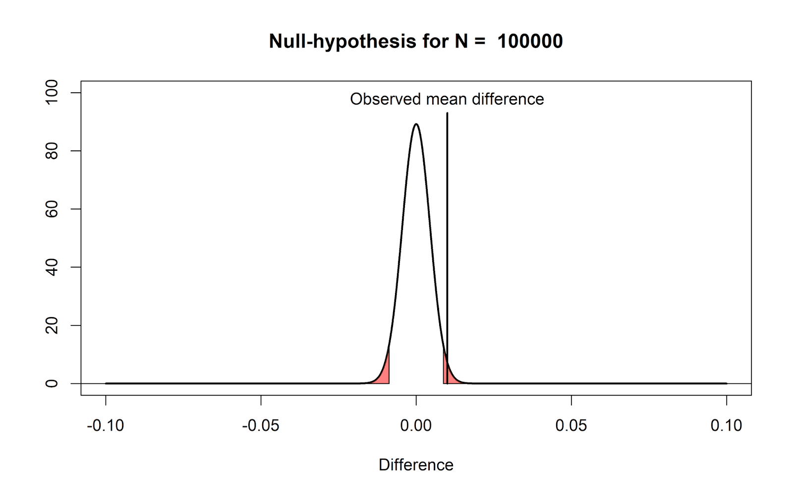
Note that nothing about the definition of a p-value changes: It still correctly indicates that, if the null-hypothesis is true, we have observed data that should be considered surprising. However, just because data is surprising, does not mean we need to care about it. It is mainly the verbal label ‘significant’ that causes confusion here – it is perhaps less confusing to think of a ‘significant’ effect as a ‘surprising’ effect (as long as the null-model is realistic - which is not automatically true).

This example illustrates why you should always report and interpret effect sizes, with hypothesis tests. This is also why it is useful to complement a hypothesis test with an equivalence test, so that you can conclude the observed difference is surprisingly small if there is no difference, but the observed difference is also surprisingly closer to zero, assuming there exists any effect we consider meaningful (and thus, we can conclude the effect is equivalence to zero).

4) If you have observed a significant finding, the probability that you have made a Type 1 error (a false positive) is not 5%.

Assume we collect 20 observations, and Omniscient Jones tells us the null-hypothesis is true. This means we are sampling from the following distribution:


If this is our reality, it means that 100% of the time that we observe a significant result, it is a false positive. Thus, 100% of our significant results are Type 1 errors. What the Type 1 error rate controls, is that from all studies we perform when the null is true, not more than 5% of our observed mean differences will fall in the red tail areas. But when they have fallen in the tail areas, they are always a Type 1 error. After observing a significant result, you can not say it has a 5% probability of being a false positive. But before you collect data, you can say you will not conclude there is an effect, when there is no effect, more than 5% of the time, in the long run.

5) One minus the p-value is not the probability of observing another significant result when the experiment is replicated.

It is impossible to calculate the probability that an effect will replicate, based on the p-value, and as a consequence, the p-value can not inform us about the p-value we will observe in future studies. When we have observed a p-value of 0.05, it is not 95% certain the finding will replicate. Only when we make additional assumptions (e.g., the assumption that the alternative effect is true, and the effect size that was observed in the original study is exactly correct) can we model the p-value distribution for future studies.

It might be useful to visualize the one very specific situation when the p-value does provide the probability that future studies will provide a significant p-value (even though in practice, we will never know if we are in this very specific situation). In the figure below we have a null-model and alternative model for 150 observations. The observed mean difference falls exactly on the threshold for the significance level. This means the p-value is 0.05. In this specific situation, it is also 95 probable that we will observe a significant result in a replication study, assuming there is a true effect as specified by the alternative model. If this alternative model is true, 95% (1-p) of the observed means will fall on the right side of the observed mean in the original study (we have a statistical power of 95%), and only 5% of the observed means will fall in the blue area (which contains the Type 2 errors). 


This very specific situation is almost always not your reality. It is not true when any other alternative hypothesis is correct. And it is not true when the the null-hypothesis is true. In short, the p-value basically never, except for one very specific situation when the alternative hypothesis is true and of a very specific size you will never know you are in, gives the probability that a future study will once again yield a significant result.

Conclusion

Probabilities are confusing, and the interpretation of a p-value is not intuitive. Grammar is also confusing, and not intuitive. But where we practice grammar in our education again and again and again until you get it, we don’t practice the interpretation of p-values again and again and again until you get it. Some repetition is probably needed. Explanations of what p-values mean are often verbal, and if there are figures, they use t-value distributions we are unfamiliar with. Instead of complaining that researchers don’t understand what p-values mean, I think we should try to explain common misconceptions multiple times, in multiple ways.


Daniel Lakens, 2017

Saturday, November 11, 2017

The Statisticians' Fallacy

If I ever make a follow up to my current MOOC, I will call it ‘Improving Your Statistical Questions’. The more I learn about how people use statistics, the more I believe the main problem is not how people interpret the numbers they get from statistical tests. The real issue is which statistical questions researchers ask from their data.

Our statistics education turns a blind eye to training people how to ask a good question. After a brief explanation of what a mean is, and a pit-stop at the normal distribution, we jump through as many tests as we can fit in the number of weeks we are teaching. We are training students to perform tests, but not to ask questions.

There are many reasons for this lack of attention in training people how to ask a good question. But here I want to focus on one reason, which I’ve dubbed the Statisticians' Fallacy: Statisticians who tell you ‘what you really want to know’, instead of explaining how to ask one specific kind of question from your data.

Let me provide some example of the Statisticians' Fallacy. In the next quotes, pay attention to the use of the word ‘want’. Cohen (1994) in his ‘The earth is round (p < .05)’ writes:


Colquhoun (2017) writes:


Or we can look at Cumming (2013):


Or Bayarri, Benjamin, Berger, and Sellke (2016):


Now, you might have noticed that these four statements by statisticians of ‘what we want’ are all different. The one says 'we want' to know the posterior probability that our hypothesis is true, the others says 'we want' to know the false positive report probability, yet another says 'we want' effect sizes and their confidence intervals, and yet another says 'we want' the strength of evidence in the data.

Now you might want to know all these things, you might want to know some of these things, and you might want to know yet other things. I have no clue what you want to know (and after teaching thousands of researchers the last 5 years, I’m pretty sure often you don't really have a clue what you want either - you've never been trained to thoroughly ask this question). But what I think I know is that statisticians don’t know what you want to know. They might think some questions are interesting enough to ask. They might argue that certain questions follow logically from a specific philosophy of science. But the idea that there is always a single thing ‘we want’ is not true. If it was, statisticians would not have been criticizing what other statisticians say ‘we want’ for the last 50 years. Telling people 'what you want to know' instead of teaching people to ask themselves what they want to know will just get us another two decades of mindless statistics.

I am not writing this to stop statisticians from criticizing each other (I like to focus on easier goals in my life, such as world peace). But after reading many statements like the ones I’ve cited above, I have distilled my main take-home message in a bathroom tile:


There are many, often complementary, questions you can ask from your data, or when performing lines of research. Now I am not going to tell you what you want. But what I want, is that we stop teaching researchers there is only a single thing they want to know. There is no room for the Statistician’s Fallacy in our education. I do not think it is useful to tell researchers what they want to know. But I think it’s a good idea to teach them about all the possible questions they can ask.


Further Reading:
Thanks to Carol Nickerson who, after reading this blog, pointed me to David Hand's Deconstructing Statistical Questions, which is an excellent article on the same topic - highly recommended.

Monday, October 16, 2017

Science-Wise False Discovery Rate Does Not Explain the Prevalence of Bad Science

Science-Wise False Discovery Rate Does Not Explain the Prevalence of Bad Science

This article explores the statistical concept of science-wise false discovery rate (SWFDR). Some authors use SWFDR and its complement, positive predictive value, to argue that most (or, at least, many) published scientific results must be wrong unless most hypotheses are a priori true. I disagree. While SWFDR is valid statistically, the real cause of bad science is “Publish or Perish”.

Introduction

Is science broken? A lot of people seem to think so, including some esteemed statisticians. One line of reasoning uses the concepts of false discovery rate and its complement, positive predictive value, to argue that most (or, at least, many) published scientific results must be wrong unless most hypotheses are a priori true.

The false discovery rate (FDR) is the probability that a significant p-value indicates a false positive, or equivalently, the proportion of significant p-values that correspond to results without a real effect. The complement, positive predictive value (\(PPV=1-FDR\)) is the probability that a significant p-value indicates a true positive, or equivalently, the proportion of significant p-values that correspond to results with real effects.

I became interested in this topic after reading Felix Schönbrodt’s blog post, “What’s the probability that a significant p-value indicates a true effect?” and playing with his ShinyApp. Schönbrodt’s post led me to David Colquhoun’s paper, “An investigation of the false discovery rate and the misinterpretation of p-values” and blog posts by Daniel Lakens, “How can p = 0.05 lead to wrong conclusions 30% of the time with a 5% Type 1 error rate?” and Will Gervais, “Power Consequences”.

The term science-wise false discovery rate (SWFDR) is from Leah Jager and Jeffrey Leek’s paper, “An estimate of the science-wise false discovery rate and application to the top medical literature”. Earlier work includes Sholom Wacholder et al’s 2004 paper “Assessing the Probability That a Positive Report is False: An Approach for Molecular Epidemiology Studies” and John Ioannidis’s 2005 paper, “Why most published research findings are false”.

Scenario

Being a programmer and not a statistician, I decided to write some R code to explore this topic on simulated data.

The program simulates a large number of problem instances representing published results, some of which are true and some false. The instances are very simple: I generate two groups of random numbers and use the t-test to assess the difference between their means. One group (the control group or simply group0) comes from a standard normal distribution with \(mean=0\). The other group (the treatment group or simply group1) is a little more involved:

  • for true instances, I take numbers from a standard normal distribution with mean d (\(d>0\));
  • for false instances, I use the same distribution as group0.

The parameter d is the effect size, aka Cohen’s d.

I use the t-test to compare the means of the groups and produce a p-value assessing whether both groups come from the same distribution.

The program does this thousands of times (drawing different random numbers each time, of course), collects the resulting p-values, and computes the FDR. The program repeats the procedure for a range of assumptions to determine the conditions under which most positive results are wrong.

For true instances, we expect the difference in means to be approximately d and for false ones to be approximately 0, but due to the vagaries of random sampling, this may not be so. If the actual difference in means is far from the expected value, the t-test may get it wrong, declaring a false instance to be positive and a true one to be negative. The goal is to see how often we get the wrong answer across a range of assumptions.

Nomenclature

To reduce confusion, I will be obsessively consistent in my terminology.

  • An instance is a single run of the simulation procedure.
  • The terms positive and negative refer to the results of the t-test. A positive instance is one for which the t-test reports a significant p-value; a negative instance is the opposite. Obviously the distinction between positive and negative depends on the chosen significance level.
  • true and false refer to the correct answers. A true instance is one where the treatment group (group1) is drawn from a distribution with \(mean=d\) (\(d>0\)). A false instance is the opposite: an instance where group1 is drawn from a distribution with \(mean=0\).
  • empirical refers to results calculated from the simulated data, as opposed to theoretical which means results calculated using standard formulas.

The simulation parameters are

parameter meaning default
prop.true fraction of cases where there is a real effect seq(.1,.9,by=.2)
m number of iterations 1e4
n sample size 16
d standardized effect size (aka Cohen’s d) c(.25,.50,.75,1,2)
pwr power. if set, the program adjusts d to achieve power NA
sig.level significance level for power calculations when pwr is set 0.05
pval.plot p-values for which we plot results c(.001,.01,.03,.05,.1)

Results

The simulation procedure with default parameters produces four graphs similar to the ones below.

In these graphs,

  • solid lines show theoretical results; dashed lines are empirical results from the simulation
  • fdr. false discovery rate
  • pval. p-value cutoff for significance
  • prop.true. proportion of true instances, i.e., ones that have a real effect
  • d. standardized effect size, aka Cohen’s d

The first graph shows FDR vs. p-value across a range of prop.true values for a single effect size (\(d=1\)). Note the difference in x (p-value) and y (FDR) scales; the p-value scale is roughly an order of magnitude smaller than FDR. For this effect size, FDR behaves pretty well: for \(prop.true=0.5\), FDR and p-value are pretty close; as prop.true gets smaller, FDR becomes larger than p-value; as prop.true gets larger, FDR shrinks below p-value. In other words, for this effect size, if most instances are true, p-values do a good job of separating the wheat from the chaff, but if most are false, p-values are less helpful. In the worse case plotted here, FDR is about 0.36 when \(pval=0.05\).

The second graph shows FDR vs. p-value across a range of effect sizes for a single value of prop.true (0.5). Again note the difference in scales. Recall that FDR behaves pretty well for this value of prop.true when \(d=1\). It’s still reasonable for \(d=0.75\). But for smaller effect sizes, FDR again grows to be much larger than p-value. In the worse case plotted here, FDR is about 0.33 when \(pval=0.05\).

We can also think of this in terms of power. As d gets smaller, so does power. The table below shows power for the default values of d. You’ll notice that power ranges from whopping good to anemic as we move from \(d=2\) to \(d=0.25\). For \(d=0.75\), power is just over 50%; at this power, FDR is about .08 when \(pval=0.05\). The table below shows FDR for all values of d under the conditions plotted here.

d 0.25 0.50 0.75 1.00 2.00
power 0.10 0.28 0.54 0.78 0.9998

The third graph shows FDR vs. prop.true across a range of p-values for a single effect size (\(d=1\)). In this graph, the x and y scales are about the same. For this effect size, FDR behaves pretty well until prop.true gets below 0.3. The inflection point at 0.3 is an artifact of the simulation; adding a few more prop.true values between 0.1 and 0.3 smooths out the curve (data not shown).

The final graph shows FDR vs. d across a range of p-values for a single value of prop.true (0.5). As d drops below 1, FDR grows rapidly as we’ve seen before. Reducing the p-value helps, as you would expect. But even with p-value=.001, FDR grows rapidly for \(d<0.5\), reaching about 0.2 for \(d=0.25\). This is because power is abysmal (.004) at this point causing us to miss most true instances. This illustrates the tradeoff between false positives and false negatives as we reduce the p-value: smaller p-values give fewer false positives but also fewer true positives.

Returning to the second graph above (FDR vs. p-value for a range of effect sizes and \(prop.true=0.5\)), we see that for small values of d and pval, the empirical results are noisy and don’t match the theoretical results very well. This is because there aren’t enough positives in this region. Increasing the number of simulations to \(10^6\) fixes the problem as shown in the graph below.

The relationship between FDR and p-value is complicated. If prop.true is 50% or better and d is 1 or more, p-values do a good job at discriminating true from false instances. Under less optimistic conditions, p-values are not so good. Under the most pessimistic conditions here, FDR is about 1/3. Reducing the significance level improves FDR but at the cost of missing more true instances.

Let’s look at extreme cases of prop.true (0.25, 0.75) and power (0.2, 0.8) for pval=.05. The table below shows theoretical FDR for these cases.

high power low power
high prop.true 0.02 0.16
low prop.true 0.08 0.43

The best case is great (FDR=0.02), the worst case is horrible (0.43), and the in-between cases range from 0.08 to 0.16. The take-home is that if most hypotheses are wrong, you have to do good, well-powered studies to find the few correct results, but if most hypotheses are correct, you may be able to get by with sloppy science.

Discussion

I started with the question, “Is science broken?” and segued to the more specific question of “Are most (or, at least many) published results wrong?” I then reported the claim that “Yes, most (or many) results must be wrong unless most hypotheses are a priori true”, because the science-wise false discovery rate (SWFDR) makes it so. Do the results here support the claim?

It depends on prop.true, so we’d better be clear about what it represents.

  • David Colquhoun’s paper seems to suggest that it refers to early stage experiments. At one point the paper says, “[I]magine that we are testing a lot of candidate drugs, one at a time. It is sadly likely that many of them would not work, so let us imagine that 10% of them work and the rest are inactive.” In the on-line post-publication discussion, Dr. Colquhoun is even more explicit: “To postulate a prevalence greater than 0.5 is tantamount to saying that you were confident that your hypothesis was right before you did the experiment.”

  • Felix Schönbrodt’s blog post has a similar statement: “It’s certainly not near 100% – in this case only trivial and obvious research questions would be investigated, which is obviously not the case.”

I disagree with this interpretation. Hypotheses exist at many stages of research from vague ideas flitting through students’ heads to more precise claims in published papers. Since we’re reasoning about the validity of published results, prop.true (and other parameters like d) must refer to hypotheses late in the research process, ones that are far enough along to be considered for publication. To understand prop.true, we need to understand how research shapes hypotheses.

What happens to the incorrect hypotheses that make it to the near-publication stage? I see three possibilities:

  1. By (bad) luck, the study yielded a significant p-value, and the happy but hapless investigators proceed to publication.
  2. The lab chief thinks the negative finding is correct and publishes the negative result or abandons the work. Sadly, this happens rarely, as we know too well.
  3. The lab chief is unconvinced and sends the student back to the lab for more experiments or to the computer for more analyses.

How this unfolds depends on the skill and motivation of the people involved. If the student is good and driven by a quest for truth, and the lab chief provides enough support, case #3 will improve the initial hypothesis and yield one that’s true. If, on the other hand, the goal is simply to publish, this step is p-hacking and will produce a positive p-value whether or not the hypothesis is true.

Ignoring the rare case #2, all hypotheses that make it this far will eventually yield positive results and be published. This makes the work we’ve done simulating SWFDR totally irrelevant. The SWFDR we get will be close to whatever value we assume for the proportion of false hypotheses. In other words, \(FDR \approx 1-prop.true\). Rather obvious, I think, and completely pointless.

I’ve seen plenty of bad science up close and personal and am thoroughly convinced that many published results in my field are rubbish. But I don’t buy the arguments based on SWFDR. The problem is p-hacking, both experimental and computational.

It’s really just another consequence of “Publish or Perish”. Those who can, publish good science; those who can’t, p-hack. No amount of statistical cleverness can change this basic dynamic. If you replace the much-maligned p-value by some other statistic s, p-hackers will become s-hackers, and the overall quality of science will remain unchanged. (See Paul Smaldino and Richard McElreath’s paper “The natural selection of bad science” for a much deeper treatment of this phenomenon.)

Good science drives the field forward; bad science is ephemeral. It’s aggravating to see so much dreck get published, but it’s even more aggravating to see good statisticians and data scientists agonizing over the ordure and spending so much effort trying to root out bad science. We will do more good by helping good scientists do good science than by trying to slow down the bad ones. Quoting the sage Oprah Winfrey (from BrainyQuote), “Be thankful for what you have; you’ll end up having more. If you concentrate on what you don’t have, you will never, ever have enough.”